
AMOREPACIFIC (President and CEO, Kyung-Bae Suh) announced ‘Arita 3.0’, a font reflecting the corporate image, on 16th January, and started its free distribution so that the general public can use it freely. Arita 3.0 is a more elegantly polished version of the Arita Korean font previously developed and released by AMOREPACIFIC. An English font has also been newly developed and added.
For the Arita 3.0 project, AMOREPACIFIC entrusted the art direction to Sang-Su Ahn, professor of the Department of Visual Design in Hongik University, who developed the existing Korean font, and entrusted the design to Michel de Boer, who was the former creative director of Studio Dumbar, a representative Dutch design group. The name, ‘Arita’, refers to the loveable and charming lady taken from ‘Lovely is this noble lady’ from the Book of Odes, and the Arita font can be downloaded from the ‘About Us’ at AMOREPACIFIC homepage of www.apgroup.com.
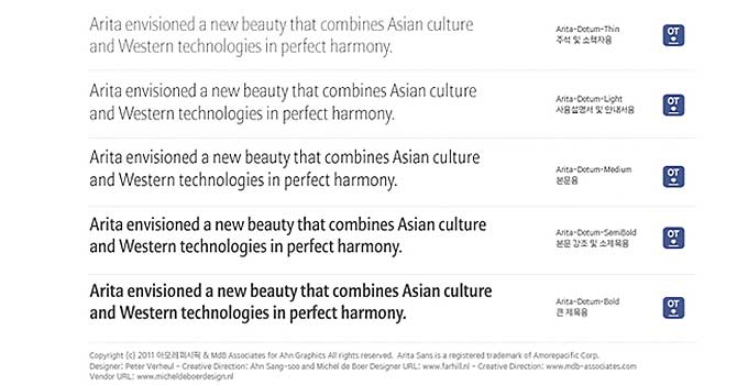
The specific focus of the newly developed Arita English font was on allowing it to be widely used as an independent font for text, by enhancing the finish and giving life to the inherent beauty of the font and charming handwriting, regarded as highly important when the Korean font was being created. The Arita English font consists of 5 type families, namely Thin, Light, Medium, Semi-Bold and Bold, and was made with various purposes in mind. Arita T (Thin, for footnotes and booklets) for the Korean font was also developed, in addition to the existing 4 type families, in line with the English font. Along with this, hinting (enhancing the quality of output results by correcting the borderlines) was carried out on all of the pre-existing type families so that it could be more accurately and neatly displayed on monitors and prints.
AMOREPACIFIC has been developing the Arita font since 2005, and opened it up to the general public for free as soon as the development of each type family was complete. Since 2006, Arita M (Medium, for text) and Arita SB (Semi-Bold, for text emphasis and straplines) Korean fonts have been distributed, and since 2007, Arita L (Light, for user manual & guidebook) and Arita B (Bold, for headlines) have also been distributed. AMOREPACIFIC, which practices culture sharing through various means, wished Arita fonts to not only perform the role of an exclusive font to its corporate identity but also for it to be widely used by the general public, thereby sharing the value of sharing. The development and distribution of English fonts are expected to contribute to further spreading these values. AMOREPACIFIC will continue to exert its efforts to develop Arita fonts, and is planning to develop and distribute additional fonts with a Batang (Ming-style) font style along with a font with a Dotum (Gothic) font style, which has already been completed.
In the meantime, the ‘Arita Font Forum’ will be held at the headquarter of AMOREPACIFIC on the 16th in commemoration of the sharing of these fonts, attended by promising Korean designers as well as Michel de Boer. There will also be in-company lectures given by Professor Sang-Su Ahn, the developer of the Korean font, Michel de Boer and Yong-Je Lee, the developer of Korean Arita. During this event, the design characteristics and significance of the Arita font, key points of the upgraded type family and testimonials will be shared. In addition, the ‘Arita Poster Exhibition’, designed by utilizing the Arita English font, will be held on the first floor of the AMOREPACIFIC headquarter for 1 week from the 16th onwards.
[Note 1] About the Arita English Font Developer - Michel de Boer
Michel de Boer is a graphic designer who was the former creative director of Studio Dumbar. Founded in 1977 by Gert Dumbar, Studio Dumbar (www.studiodumbar.com) is one of the representative design groups in the Netherlands. It is engaged in design activities in areas including CI, industrial design, public design, and architecture. Michel carried out design projects with corporations such as Apple, Allianz, Nike and Nokia, and also worked for public institutions such as the European Central Bank, the Danish Postal Service and the Dutch Police (car design). In Korea, he worked on the typographics of the national traffic sign board for the Ministry of Land, Transport and Maritime Affairs and on the typographics of the public design for Paju Unjeong area. With his excellent work, he won two Gold Pencils and seven Silver Pencils at D&AD, a design competition referred to as ‘the Oscars of the creative industry’, and had the honor of winning prizes including the Best-of-the-Best Grand Prix at the Red Dot Awards, regarded as the one of the top 3 design awards in the world.
[Note 2] About the Arita Korean Font Developer – Sang-Su Ahn
Sang-Su Ahn, Professor of the Department of Visual Design in Hongik University is an expert in Korean font design and typography design. He has developed a wide range of fonts, including Ahnsangsu font, Isang font, Mir font and Mano font. He was selected as the first Korean member of AGI (Alliance Graphique Internationale) in 1999 and appointed as the new chairman of the board of the Seoul Design Foundation in 2012. In 1983, he won the Korea Newspaper Award for his study on the readability of newspaper type, received a commendation from the Korean Society for his meritorious deed of contributing to the development of Hangul (the Korean alphabet) in 1988, and was presented with the Gutenberg Award by the German city of Leipzig for his contribution to the development of Korean fonts in 2007. The greatest feature of the Korean font developed by Professor Sang-Su Ahn is that it is based on the ideology of the invention of Hangul. The Arita Korean font aims to resemble the feel of handwriting to the maximum extent, by reflecting the motions of hand and body, and the simplicity to mirror the future-oriented image, in order to fit the corporate characteristics of AMOREPACIFIC, which pursues the beauty and health inherent in Hangul.